May 23, 2025
3 min
Best Accessibility Plugins for Web Audits (Real Examples, No Bullshit)
 JL
JLJustyna Lubimow
Doing a web accessibility audit? These are the plugins that actually help. No filler, no distractions—just real tools that make your work easier and your audits better.
When you're doing a website accessibility audit, the right tools can save you hours. But not all plugins are created equal. Some are bloated, some buggy, and some just plain useless. After a lot of trial and error (and a fair bit of frustration), here’s a list of real plugins that actually help.
1. axe DevTools – Web Accessibility Testing
axe DevTools is hands-down one of the most professional accessibility testing plugins. It integrates directly with your browser’s DevTools and runs comprehensive audits. You’ll get a list of issues categorized by severity, along with guidance on how to fix them. It’s incredibly detailed, yet beginner-friendly.
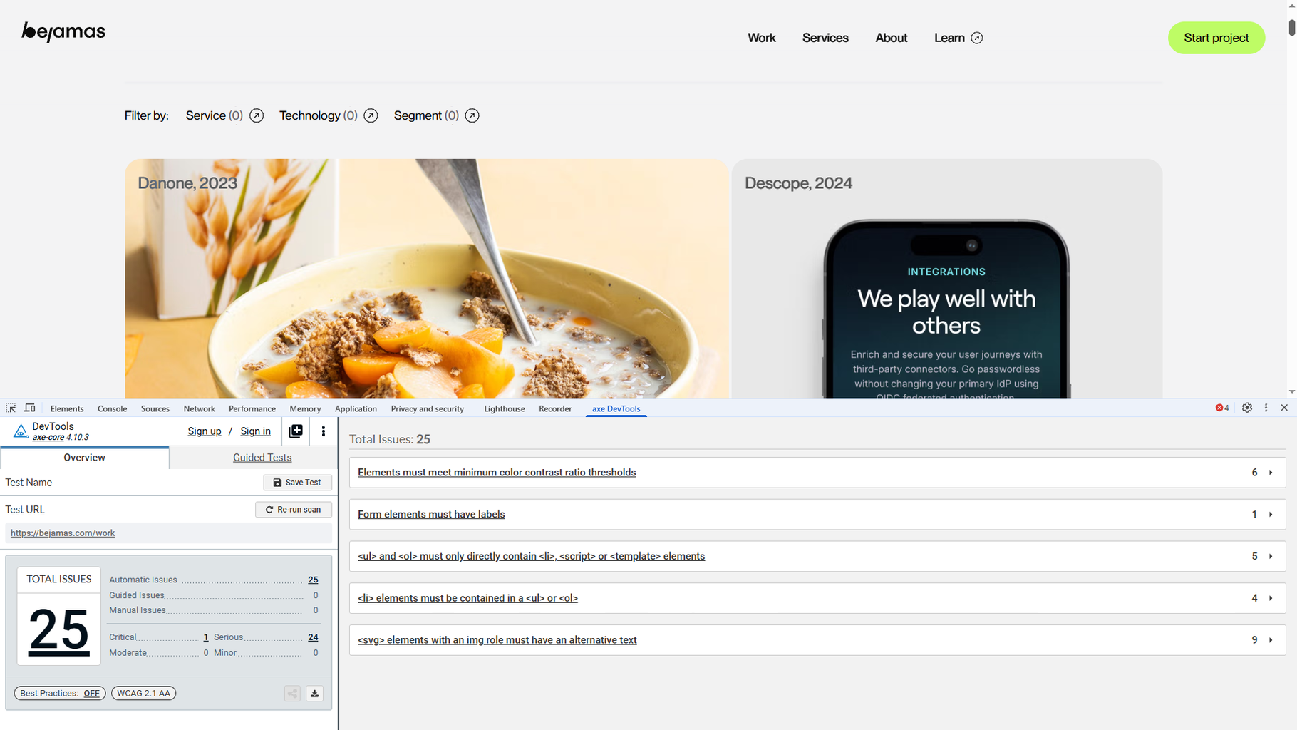
Why it’s awesome:
- Automatic scans for WCAG issues
- Clear, easy-to-read explanations
- Helps build detailed audit reports
2. Headings Map – Check Heading Structure in Seconds
Heading hierarchy is a crucial part of accessibility. Headings Map instantly shows you whether the page structure makes sense: if heading levels are skipped (like jumping from H1 to H3), or if headings are used for visual styling instead of actual structure.
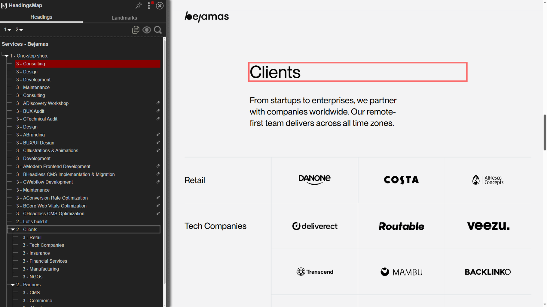
Why it’s awesome:
- Quick visualization of heading order
- Instantly highlights hierarchy mistakes
- No coding knowledge needed
3. Image Alt Text Viewer – Alt Texts at a Glance
Missing alt text is a huge accessibility fail. This plugin overlays the alt texts directly on images, so you can immediately see what’s missing—or whether existing descriptions actually make sense.
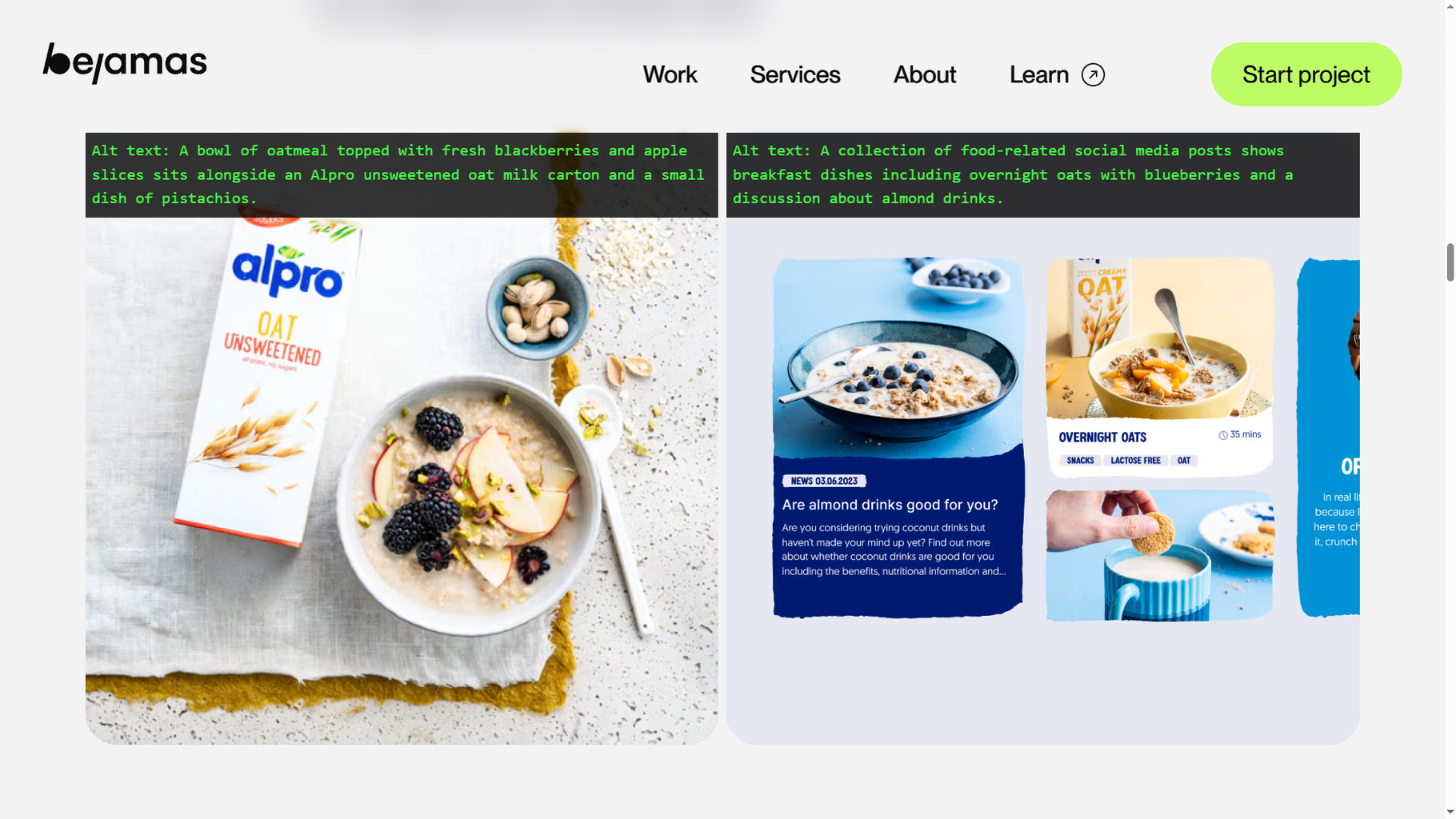
Why it’s awesome:
- Saves hours hunting down missing alt text
- Super clear visual display
- Helps you prioritize fixes fast
4. Taba11y – Test Keyboard Navigation Like a Pro
Keyboard navigation is often overlooked—but it’s essential. Taba11y shows you whether your site can be fully navigated using just a keyboard. (Spoiler: many can’t.)
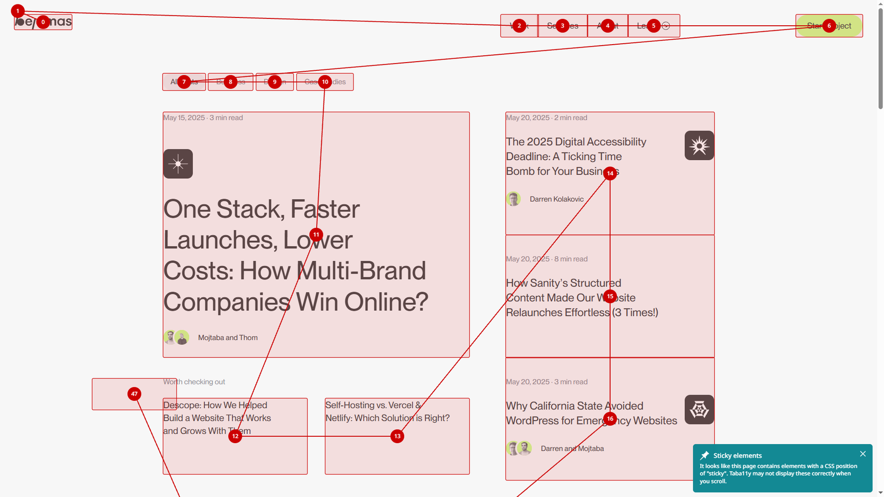
Why it’s awesome:
- Quickly identifies focus issues
- Great for demonstrating accessibility gaps in reports
- Makes it easy to show stakeholders what’s broken
5. Text Spacing Editor – No Code Needed
Poor text spacing can make content unreadable for users with dyslexia or visual impairments. This plugin lets you tweak spacing settings—line height, letter spacing, paragraph gaps—right in the browser, no code required.
Why it’s awesome:
- Instantly adjust spacing and check readability
- See if the site still “works” visually
- Perfect for non-developers
6. WAVE Evaluation Tool – Your Quick Accessibility Snapshot
WAVE gives you a simple breakdown of accessibility issues. It highlights problems directly on the page and provides a sidebar summary. Fast and easy.
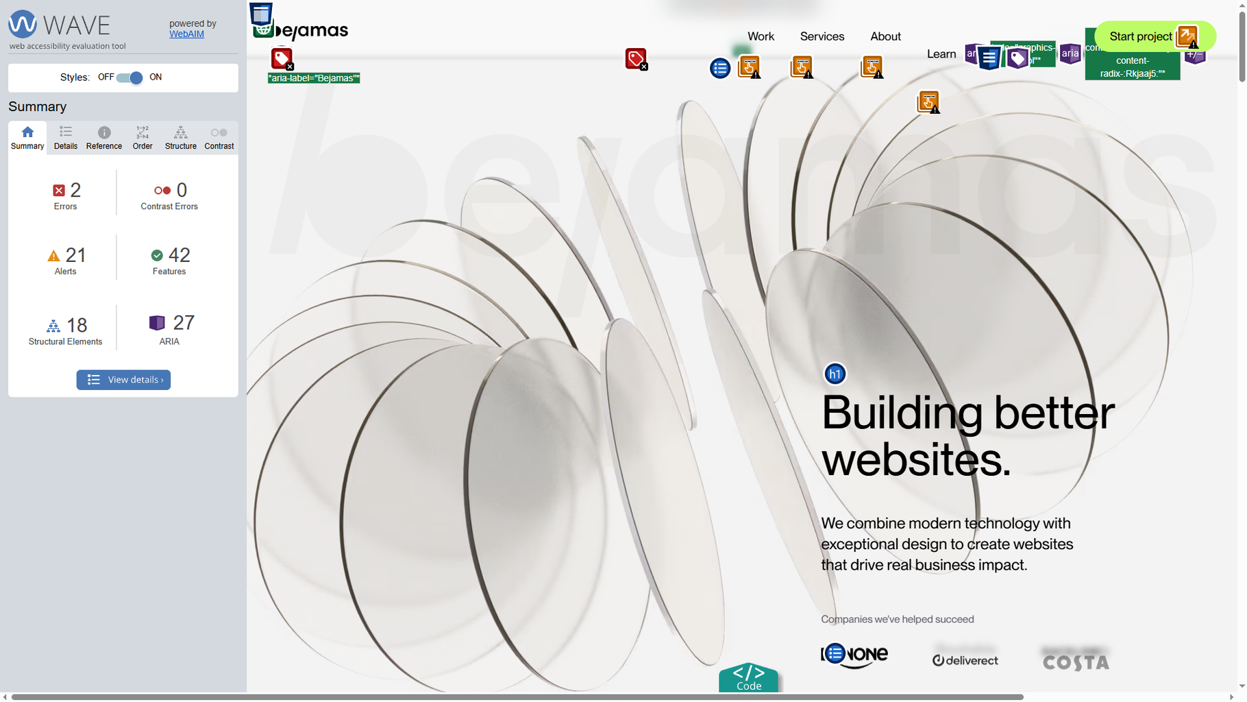
Why it’s awesome:
- Immediate visual feedback
- Easy to screenshot and include in reports
- Great first step before a deeper audit
7. WCAG Color Contrast Checker – Best of the Bunch (But Still, Be Careful)
Contrast checkers are tricky. This one isn’t perfect, but it’s better than most. It checks if your text meets WCAG minimum contrast ratios—but don’t rely on it alone. Use your own eyes too.
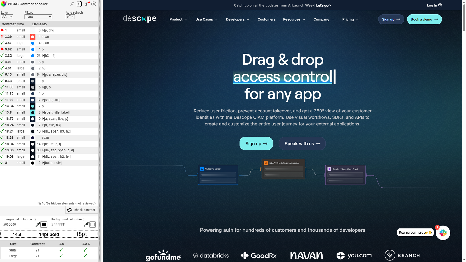
Why it’s awesome:
- Fast color contrast checks
- Useful for quick validations
- Just remember: it’s a tool, not a replacement for human review
Join Newsletter
Like practical tips like this? Subscribe for more accessibility insights.
Final Tips
If you’re looking for a practical flow for using these tools during a real audit, here’s a simple approach:
- Start with axe DevTools to catch critical errors quickly.
- Map the heading structure early to spot sloppy HTML.
- Visually check alt texts—don’t miss the obvious.
- Test keyboard navigation to catch big usability problems.
- Play with text spacing to see if the design holds up.
- Use WAVE for a quick overview and annotated screenshots.
- Run contrast tests, but always double-check manually.
Bottom line? These plugins won’t replace a full accessibility audit—but they’ll make your life 10x easier. If you’re serious about building inclusive websites, start using them today.
P.S. If you discover a better plugin than the ones listed here, let us know. Accessibility is a moving target—the more tools in your toolbox, the better.
Make Your Site Accessible
Need help making your site accessible? We run full audits and fix what matters. Let’s talk.
Authors
 JL
JLUX/UI designer specializing in conversion rate optimization, audits and design. Passionate about creating intuituve and accessible design experiences.