December 12, 2025
2 min
Introducing bejamas/ui — an Astro-Native Component Library
 TK
TK MS
MSThom and Mojtaba
It brings shadcn-style flexibility to Astro without adding React to your stack.
Today we’re open sourcing bejamas/ui, an Astro-native UI component library built on Tailwind CSS v4. It takes inspiration from shadcn/ui’s workflow but follows Astro’s server-first approach from the foundation up.
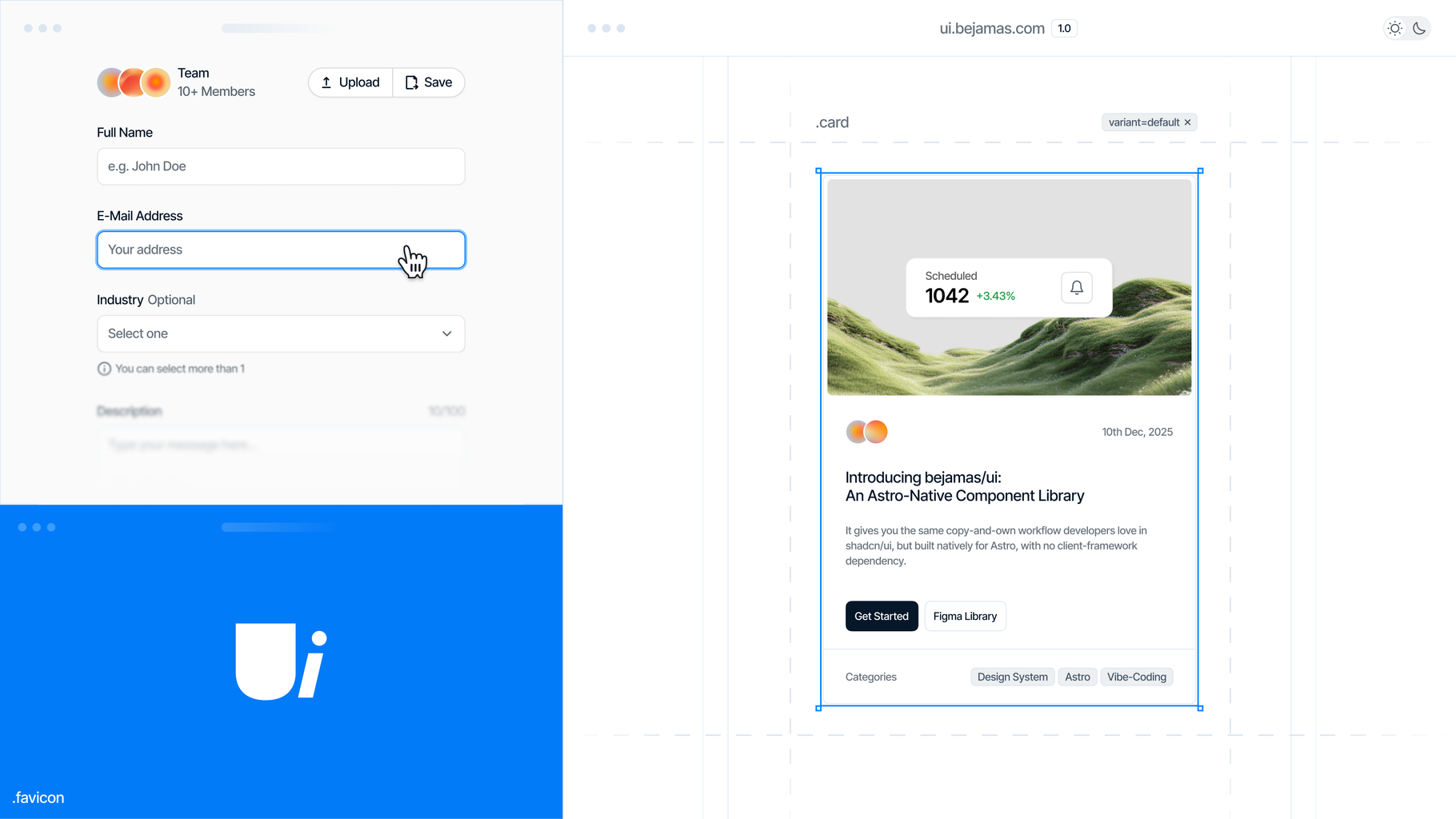
bejamas/ui gives you copy-and-own components that live directly in your codebase. They follow your conventions, stay readable, and scale naturally into a design system as your product grows. No black-box dependencies, no hidden layers, no React required.
or keep reading to learn more!
Background
Astro has never had a fully native component library. You can use shadcn/ui inside Astro, but that brings React into the project for basic interface elements.
bejamas/ui fills that gap with Astro-native components, zero-JS defaults, and a workflow that emphasizes ownership. If your team is building on Astro, this gives you the UI layer that fits the framework’s philosophy.
How It Works
Copy the code → own the code
Components are plain .astro files written with HTML and Tailwind utilities. There’s no abstraction layer and nothing hidden. You read the code, adjust it, and extend it as needed. It carries the spirit of shadcn/ui but is built for Astro from day one. Token naming aligns with shadcn/ui too, so tools like tweakcn.com work without changes.
Auto-generated documentation
Documentation stays close to the source. Structured comment blocks inside each component are parsed by the CLI to generate MDX pages for Astro Starlight. That keeps the docs synchronized, clean, and easy to maintain without Storybook, React, or extra runtime layers.
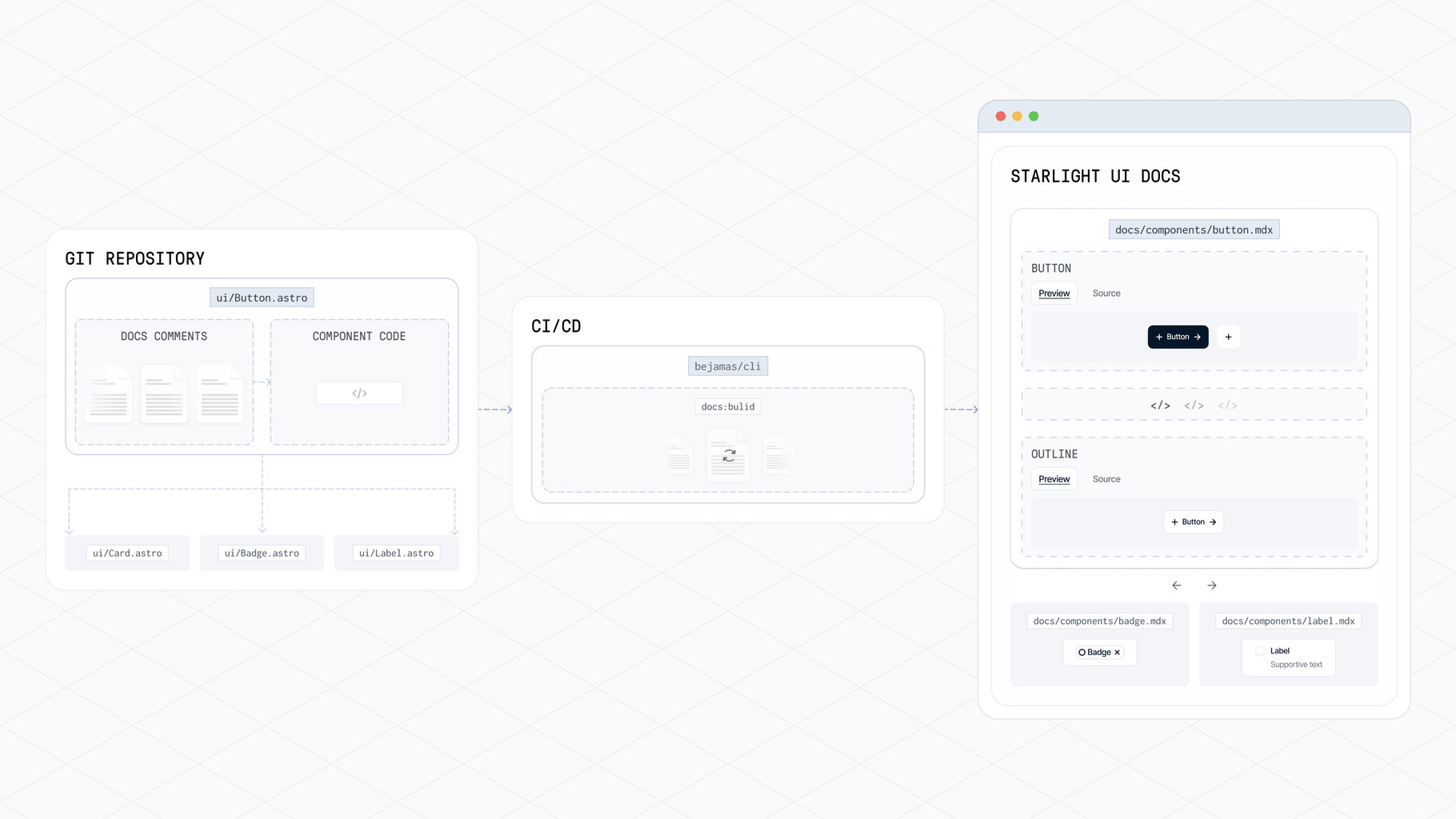
Docs generation flow
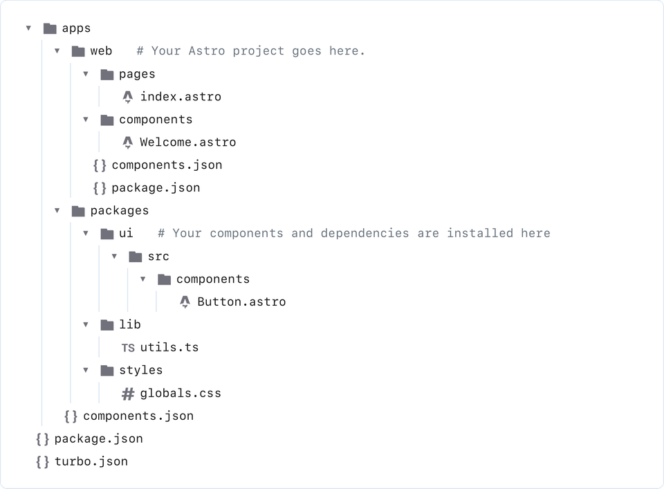
Built for monorepos
bejamas/ui fits naturally in monorepos. Your UI package, applications, and documentation can sit together in a single structure. Components act as a shared source of truth, theming stays consistent, and updates move predictably across projects. The CLI scaffolds the app, the UI workspace, and an optional documentation workspace, keeping the workflow coherent from the beginning.
Works with microfrontends
Teams can use bejamas/ui however they prefer — as a shared workspace in a monorepo or as a published npm package inside independent applications. This keeps teams autonomous while staying aligned on tokens, naming conventions, and patterns.
Figma library included
The Figma library mirrors the coded components with light/dark theming, variables, auto-layout, and configuration options for multi-brand systems. Designers and developers work from the same building blocks, reducing friction from design to production.
Get Started
Create a new project:
bunx bejamas@latest initChoose a single-app or monorepo setup. Then add your first component:
bunx bejamas@latest add buttonYour component is now in your codebase, ready to tailor to your needs.
What’s Next
This is only the first release. The component library will grow, the CLI will evolve, and more tooling will arrive for teams handling multiple brands and design systems.
Try bejamas/ui in your next Astro project and let us know what works, what doesn’t, and what you’d like to see next.
Authors
 TK
TKCo-founder of Bejamas. Focuses on helping people create faster and better websites and apps. Never bet against the Web.
 MS
MSCrafting content on modern web technologies.