(1)
Neobrutalism Illustrations
Dodonut
Dodonut is a web design agency with a mission to create stunning and impactful digital products that promote environmental sustainability.
With Dodonut, we had the freedom to explore a style that matched our shared values — bold, honest, and rooted in purpose. The direction came from many conversations about how design can communicate clearly without adding noise.
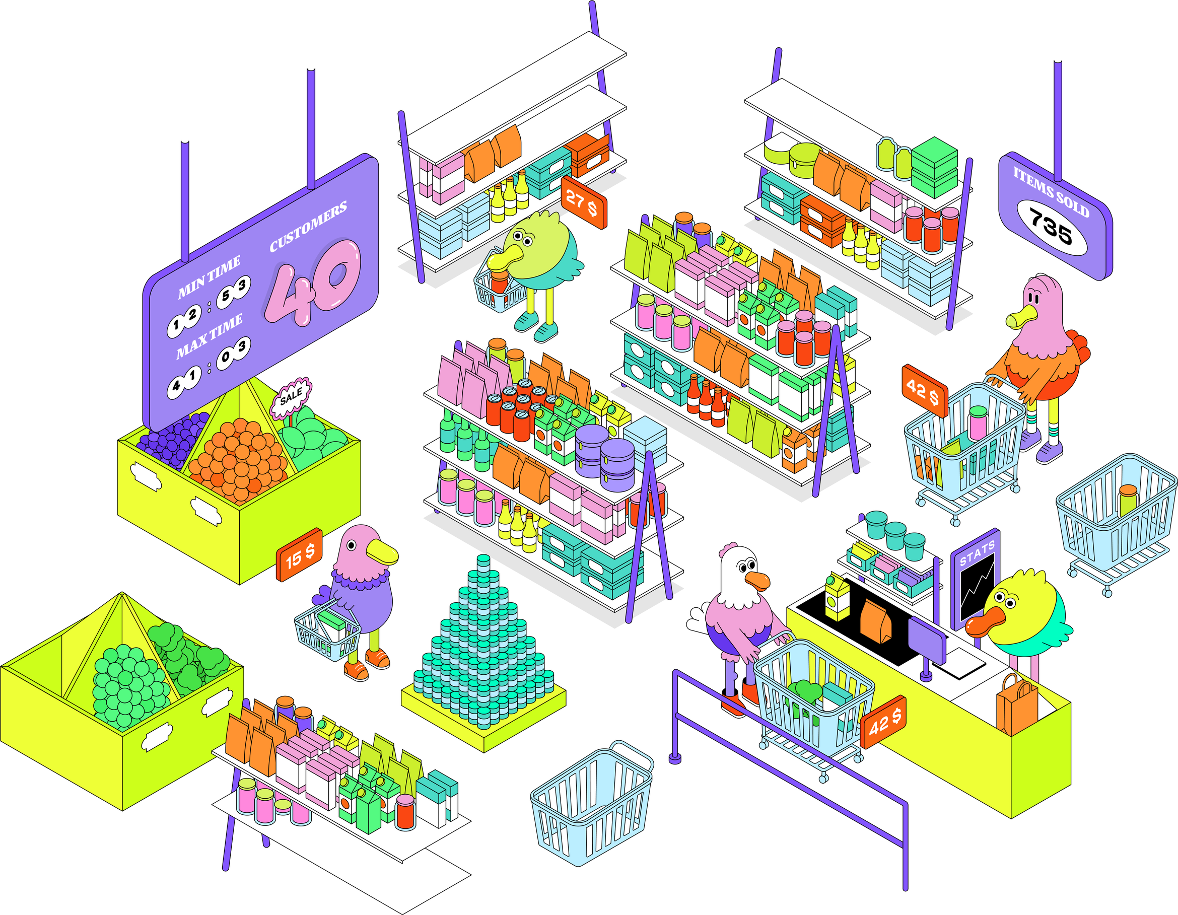
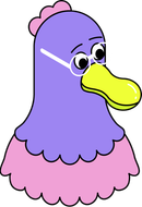

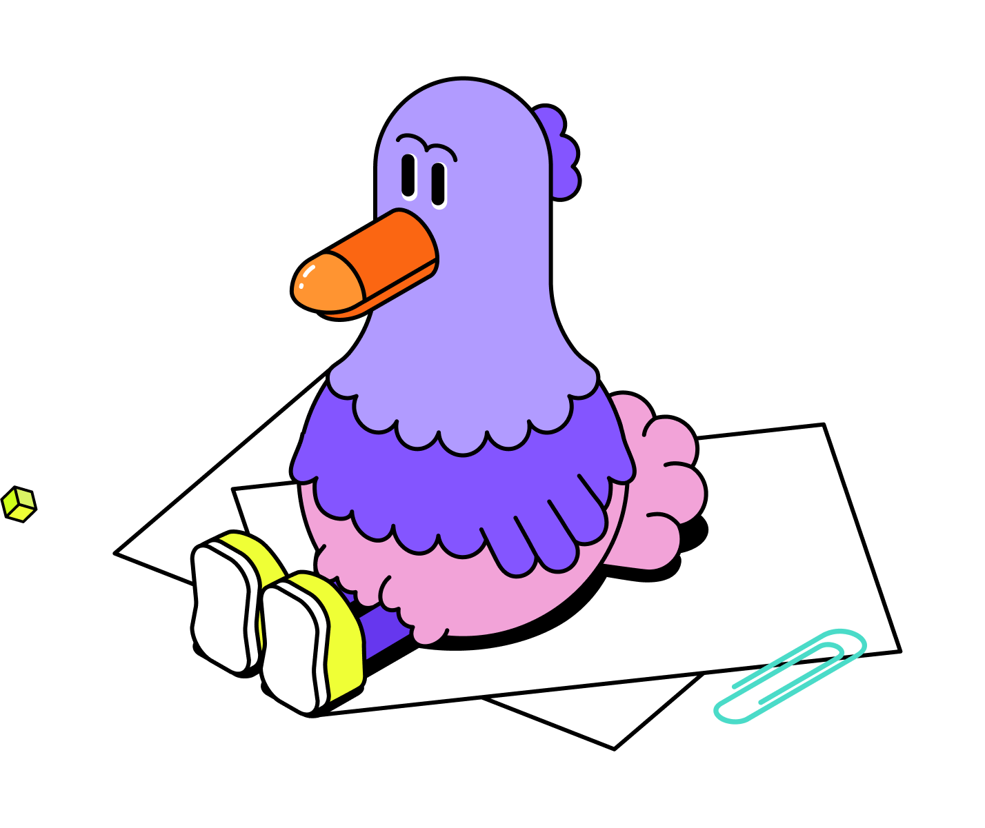
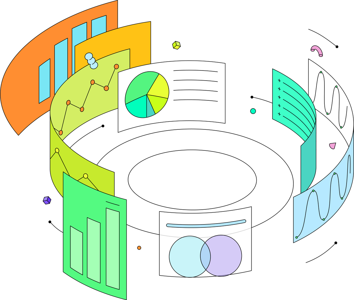
We created a system of illustrations and colors in the neubrutalist style, aiming for simple shapes and a clean look. Combining this with isometric illustrations gave the brand a unique and modern edge.
We kept the illustrations minimal and expressive, using just a few strong shapes to make each one clear and full of character.
Each illustration had a job to do — guide the eye, support the message, or give the layout some breathing space. Nothing felt extra. Just clarity, rhythm, and intention built into every shape.

Icons

We explored a neubrutalist style — bold colors, sharp contrasts, and simplified forms that leave space for meaning.
Justyna Lasota, lead illustrator
Let’s create visuals that are both expressive and purposeful.
Looking for illustrations that stand out while staying true to your brand values? Let’s create visuals that are both expressive and purposeful.
Creative team
 JL
JLWeb designer and graphic designer specializing in creating functional, user-friendly digital experiences. Focused on illustration and animation, constantly exploring new ways to bring designs to life.
 TO
TOHead of Design at Bejamas. Expert in UX/UI and Lean Methodology. Passionate about sustainable design and creating scalable digital experiences.