March 30, 2026
2 min
How we handle interactive components in Astro without reaching for React
 MS
MSMojtaba SeyediContent Writer
Astro is a great fit for teams that want to ship fast, lean sites. Server-first, zero JS by default, full control over what goes to the browser. It's a compelling stack — until you need a modal.
Not because modals are hard to build. Because building them correctly is a different problem. Focus trapping, keyboard navigation, ARIA roles, escape-to-close, backdrop handling — these are the details that separate a component that looks right from one that actually works for every user.
This is the moment most Astro projects quietly add React.
We didn't want to do that. So we built something instead.
The gap
When we started building bejamas/ui — an open-source UI component library for Astro — most components were straightforward. Cards, buttons, badges, typography. Pure HTML and Tailwind CSS. No JavaScript needed.
But some components can't be CSS-only. Dialogs, accordions, tabs — they need behavior. And that behavior needs to be accessible, or it's not really done.
The options on the table weren't great:
- Radix UI, Headless UI — excellent libraries, React-only
- Custom vanilla JS per component — fragile, hard to maintain, accessibility is easy to get wrong
- Web Components — possible, but heavy for small interactive primitives
None of these fit well with what Astro projects actually look like.
What we built
@data-slot is a collection of headless, framework-agnostic JavaScript packages — one per UI pattern. Each package is tiny, unstyled, and focused on a single job: take a plain HTML element and wire up the behavior it needs.
At the time of writing, there are 15 packages in total, covering the interactive patterns you'll actually reach for.
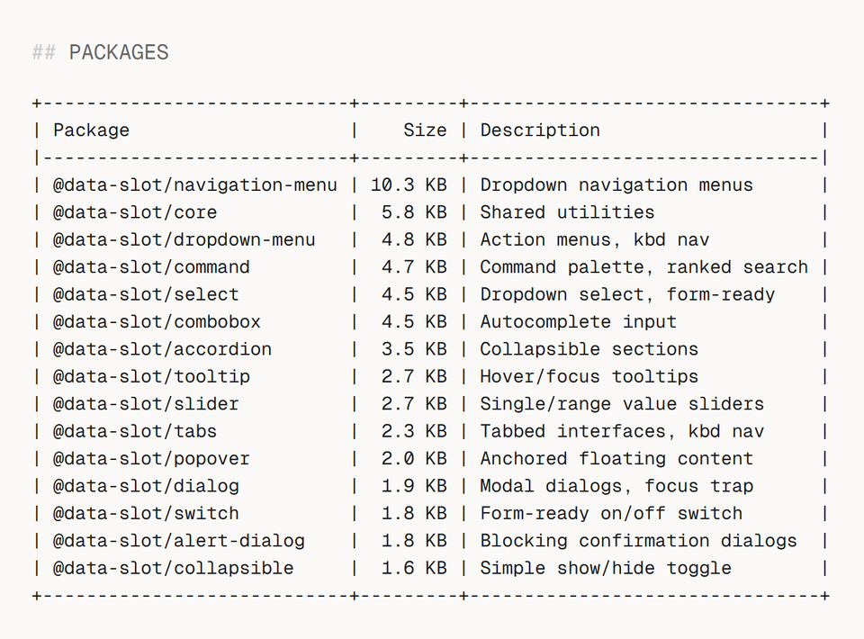
The largest package is 10.3 KB. Most are under 4 KB. You only install what you need.
How to use it
Install only the packages you need:
bun add @data-slot/tabs

bun add @data-slot/dialog
Mark your HTML with data-slot attributes:
<div data-slot="tabs" data-default-value="one">
  <div data-slot="tabs-list">
    <button data-slot="tabs-trigger" data-value="one">Tab One</button>
    <button data-slot="tabs-trigger" data-value="two">Tab Two</button>
  </div>
  <div data-slot="tabs-content" data-value="one">Content One</div>
  <div data-slot="tabs-content" data-value="two">Content Two</div>
</div>
Then call create() to bind the behavior:
import { create } from "@data-slot/tabs";

// Auto-discover and bind all [data-slot="tabs"] elements
const controllers = create();

// Or target a specific element
import { createTabs } from "@data-slot/tabs";
const tabs = createTabs(element);
That's it. Keyboard navigation, ARIA attributes, focus management — all handled. You keep full control over markup and styling.
Why this pattern works well with Astro
Astro components are server-rendered by default. @data-slot fits cleanly into that model — components render as real HTML first, JavaScript enhances them after. Progressive enhancement with no special configuration.
Because each package is small and independent, you only ship behavior for what you actually use. A project with no dialogs sends no dialog JavaScript to the browser.
And because behavior lives in a versioned package rather than inlined into component files, accessibility fixes and improvements propagate through a regular dependency update — not a manual find-and-replace across your codebase.
Try it
Go to data-slot.com and give it a try. Also, If you want a full Astro component library built on top of @data-slot, check out bejamas/ui.